cover draft 1
i started out with this very basic design. i wanted to balance the text and graphic elements a bit. because our logo is just stylized “dftc” text, it wouldn’t be feasible to use the logo as the center object. i chose to use a circle to represent unity. the circle is filled with a gradient of the colors of the rainbow, specifically the colors in dftc’s branding handbook. to balance out the corners of the graphic a little more, i opted to put the texts “spring 2023 yearbook” on the top right corner of the circle. i added the background color to the top right of the circle as well to help it better blend into the background.
cover draft 3
for my third draft, i tried a different layout; one similar to my first draft. in this draft, however, i decreased the radius of the circle gradient a bit when compared to the first draft. i also slightly lowered the opacity of the circle gradient to create easier readability of the texts. the lower opacity of the circle gradient along with the dark text will create a stronger contrast, thus addresses any accessibility concerns that may come with layering texts on top of graphical elements in the same space.
cover draft 2
for my second draft, i decreased the radius of the circle gradient, and tried adding a serif text below the sans serif text for more variation. i still wanted a bit of balance on the right side, so i opted to keep the text on the top right of the circle.
i also changed the letter spacing between the words “friends” and “theatre” so it would fill up the horizontal space between the left border of the canvas and the circle gradient on the right.
cover draft 4
while i still wanted to keep the concept of a circle representing unity, i decided to try out an oval shape. the half oval shape would create a dome like figure, symbolizing a protective cover over the LGBTQ+ community, which would still align with the overall message i would like to send with my graphic. the opacity of the gradient remains the same as the opacity from the previous draft. much like the previous draft, i also opted to pair a sans serif font with a serif font for text variety while providing easy readability for the audience.
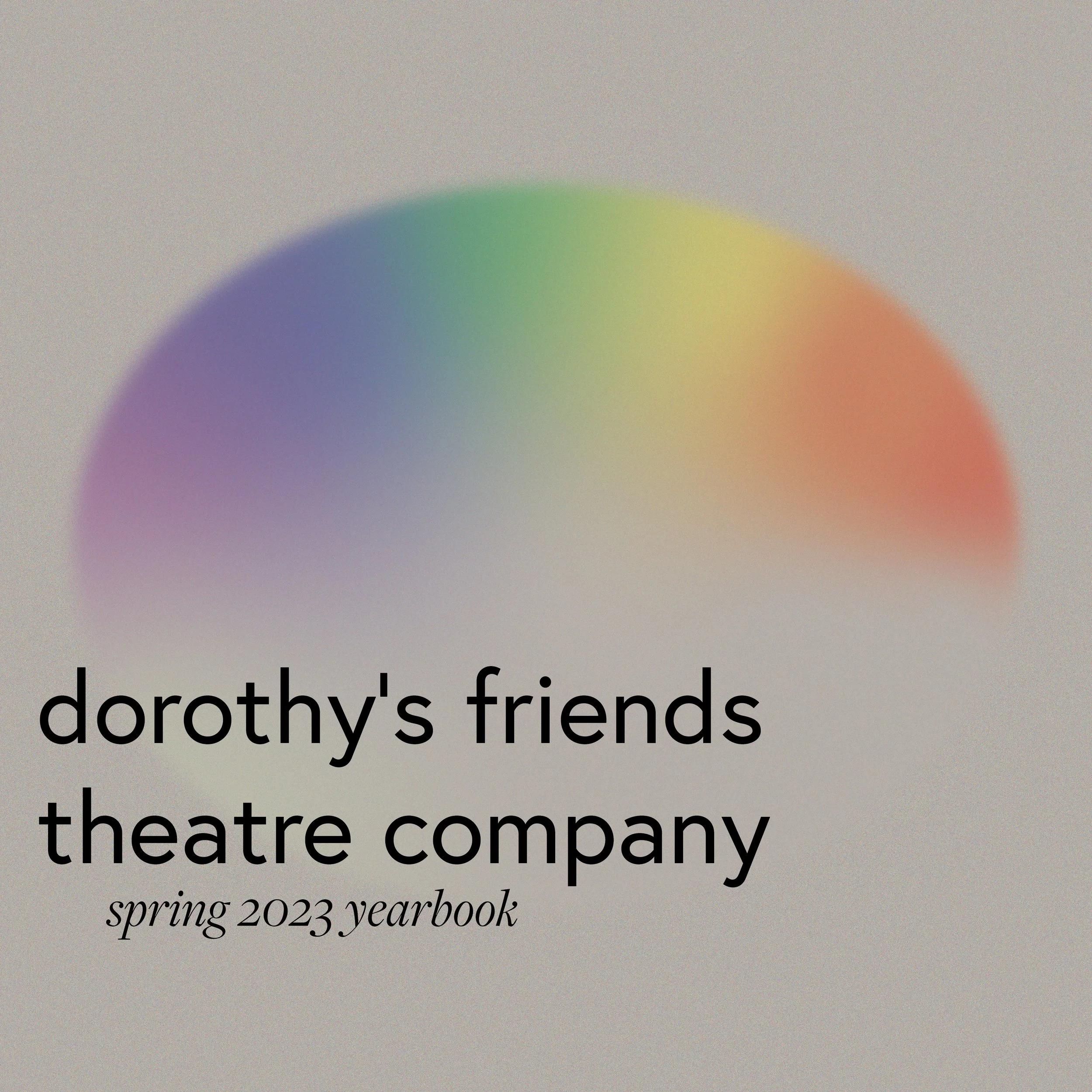
dftc spring 2023 yearbook
promotional graphics | graphic design
may 2023
tools used: adobe illustrator
cover draft 5 and 6
for drafts 5 and 6, i chose to change the background color to match that of the pages of the yearbook (presented at the bottom of the page). with the background color being a bit darker compared to the white reading background from before, i bumped up the font weights a bit to address any accessibility concerns that might arise. i also chose to use the original font weight for draft 6 just to see what it would look like.
between the two drafts, i ended up liking draft 5 with the heavier font weight a bit more. i chose to place the texts off centered for a bit more variety.
cover drafts 7 and 8
i decided to try out placing the texts around the outer and inner paths of the oval shape to see what it would look like. i actually really liked the one with the white reading background. i also like how the greenish tone on the left side of the oval manifests itself slightly when the background is changed to a darker beige color to match the background of the other pages.
another element in this draft that’s different compared to the other drafts is the font choices. something worth mentioning is that dftc’s “standard font” is europa. which i chose to use as the sans serif font of this draft. the serif font i chose to use in this draft is the same as before, freight.
if i were to make some edits to these designs, i would change the font size and weight a bit to create a more balanced or “correct” hierarchy between the texts “dorothy’s friends theatre company” and “spring 2023 yearbook.” the designs that my team and i settled on are presented in the next section.