innod challenge
design application challenge | front-end web design
january 2024
tools used: adobe photoshop and figma


presented above are designs of the mockup i created for the home page of Dotto, a modern stationary company that wants to differentiate themselves through intentional branding.
in their client brief, they mentioned that they are looking for striking and bold colors. i utilized the primary color that was provided in the brief paired with a dark grey background with very light grain textures. the dark background paired with the light pink shade creates a striking contrast that makes the color pop even more. since they mentioned using bold typography, i chose to utilize the font Bee Four as the main sans serif font. the bold sans serif font creates a strong image while making sure the texts can be easily readable and understood. i also added a slight pink glow around the landing page title text to help it stand out more and create a greater contrast between the colors.
with the glow in place and the text being in the center and taking up the majority of the space, this landing page pays close attention to the client’s requests of mindful use of negative space as well as keeping the structure simple. the vision i had in my mind for the landing page, to put myself in the scenario where im working with a web developer, the glow would have a slight pulsing glowing effect to it. the pulsing glowing effect would be noticeable but subtle enough to not be distracting.
i showed two different top sections below. once the user starts scrolling, the “DOTTO” text would move to the top bar along with the other pages of the website instead of staying as a static landing page so users can easily navigate to other pages whilst browsing the rest of the home page. the top menu bar would also be there in a static scroll on all the other pages.
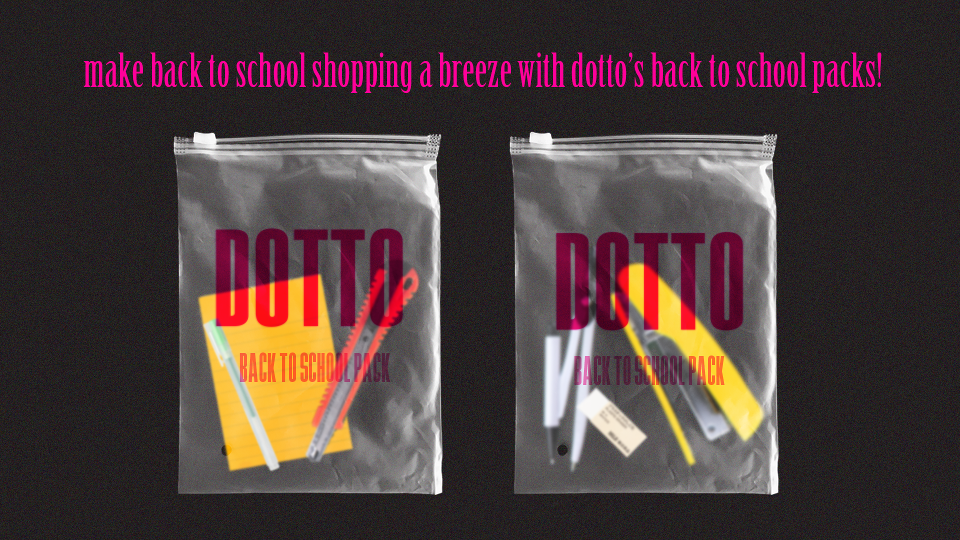
for the second section of the website, i chose to create these “back to school packs” to represent the back to school deal that DOTTO is doing. i created these mockups with the zip bags to fit in with the client’s maximalist views. i also chose to put in yellow and orange stationery to align with the client’s request of bold striking colors. to make sure the branding component is included, i made sure to include DOTTO in its signature color. the tagline “make back to school shopping a breeze with dotto’s back to school packs!” makes it clear to the user what product DOTTO is marketing and to once again reinforce the marketing aspect of the page. for the tagline, i chose to use the font Birch Std which is easy to read and pairs well with the main font used.
the next section is my way of showcasing some of dotto’s other products on their homepage. i envisioned for the circular texts to be rotating. since the rotation can’t be shown through a mockup, i rotated them different ways to show that they are supposed to be rotating in non-uniform ways. the circular texts showcase the name of the product and the turning motion will make the product name much easier to read. this choice here keeps the user’s experience of the website in mind. once the user hovers over a product, the turning of that specific product name will stop, and the price of the specific product will show below the circle as shown in the image with just the product section. the images of the stationery are simplistic yet the striking pink color shows contrast that is once against inspired by maximalist views. for the text around the product, i chose to use the font Alfaro, which is another bold sans serif font that is slightly wider and easier to read for smaller texts compared to the Bee Four font i used for the main brand text.
the next section is how i envisioned the brand’s information to be displayed on the homepage. the information is shown in a way that differentiates themselves from other typical stationery brands. the glow around the lines grabs the users’ attention in an inviting way for users to read the information. the background would then be an image of the store with a threshold and gradient map over it which, once again, builds depth and contrast while aligning with the elements of maximalism the client is inspired by. for the texts in this section, i utilized the font Birch Std again for the center text paired with Newake, another bold sans serif font that is easy on the eyes for longer texts.
i also added a little footer which would just include the typical information to be included in a footer: links to other pages, FAQs, store locations, as well as forms of contacting the brand. the “logo” is placed in the middle for branding and marketing purposes, making sure that the brand name is the last thing the users see on this page. the fonts used on this page are all fonts that were previously used. this choice was made to establish branding.
attached below is what the sections would look like when all connected.
again, feel free to click on the image for an enlarged view
ON HOVER →
attached in this section includes the different variations of the page i went through before getting to the final designs presented above.
i experimented with different ways to showcase dotto’s products. i contemplated wrapping every product with the reflective plastic cover shown below to fit in with their maximalist views, but then decided that it looked a little too messy and repetitive. since the project brief for the website does include that creative choices should be balanced between simplicity and structure. the way that i opted to present the products shown above aligned more with the simplistic values that dotto has chosen for their website. i also originally chose to use a simple dark grey background for the “who are we” page, but decided to go with the threshold background to align with dotto’s maximalist design values.


