werner's nomenclature of colors
personal project | computer programming
september 2020
tools used: wolfram mathematica
this project was inspired by werner’s nomenclature of colors published by p. syme. i came across this project when i was doing some research on color pairings. i was marveled by the amazing graphic that presented the relationship between the different hues and their different values. i decided to do my own exploration of color and eventually recreate the poster. i recreated the poster using the software wolfram mathematica, and also engaged in some minor explorational projects with the application as well. during the process of recreating the poster, i came up with formulas and equations that processed the data and related them to each other, creating the final poster that showcased the relationship between the different hues.

this is the original poster produced by P. Syme and can be found here.
for my first exploration, i analyzed the colors used in the painting mona lisa by leonardo da vinci. i split the painting into the three primary colors. i then split the colors used primarily in the painting on a color spectrum. the image on the right shows about where the dominant colors of the painting land on the spectrum of colors.


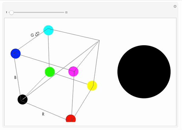
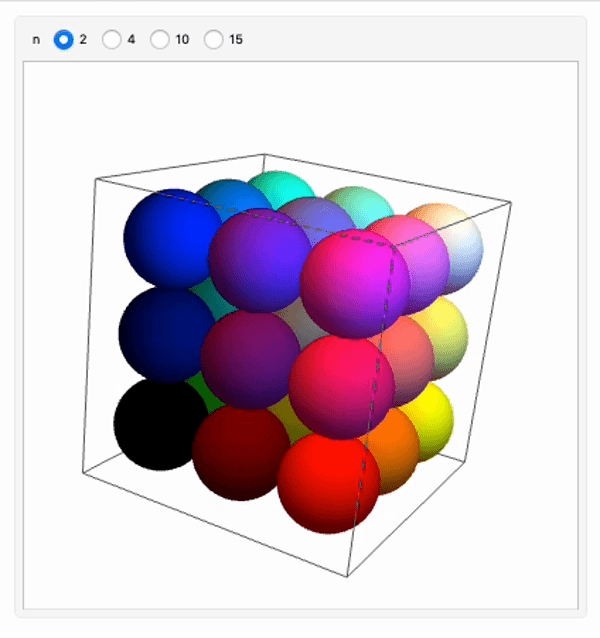
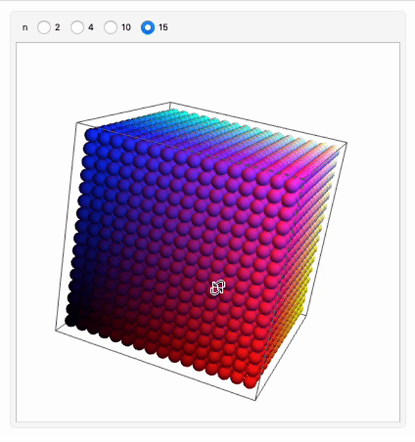
for this exploration, i created a cube that included the tertiary colors. this exploration has two parts. the graphic on the left is interactive and allows the used to drag the radio button, which will move a circle from the left bottom corner of a cube along the diagonal to the other end of the cube. the circular figure within the cube will change color depending on its location in the cube. the diagonal the circular figure is being dragged across represents the grayscale spectrum. to the right of the cube is a circle which shows the color that is currently being produced.